
A list tells you what exists.
A relationship tells you why it matters.
A SQL sensor, a virtualization host and a web service may all be healthy today. The useful question is how they support the same service — and which measurements justify its forecast.
Start with the service
Bring a service blueprint into view and see the platforms and devices it depends on. Share a common picture with the people who run the application and the infrastructure.
Follow the evidence
Trace a Trends sensor back to its source measurements. See which sensors represent the service, support its diagnostics or provide evidence for its calculations.
Make the story visible
Use focused service views, dependency stars and full maps to explain the same environment at different levels of detail. Colors and labels give each connection a meaning.
The whole graph is only
the starting point.
A connected environment can produce a very complex map. You can explore it one question at a time. Start with the full network, focus on one service, then follow a single diagnostic back to its evidence.
One graph. Different questions. A controlled investigation.
The following views come from the same complete dependency map. Qbilon's search, focus and asset filters let you narrow what is visible while retaining the meaning and direction of the relationships.
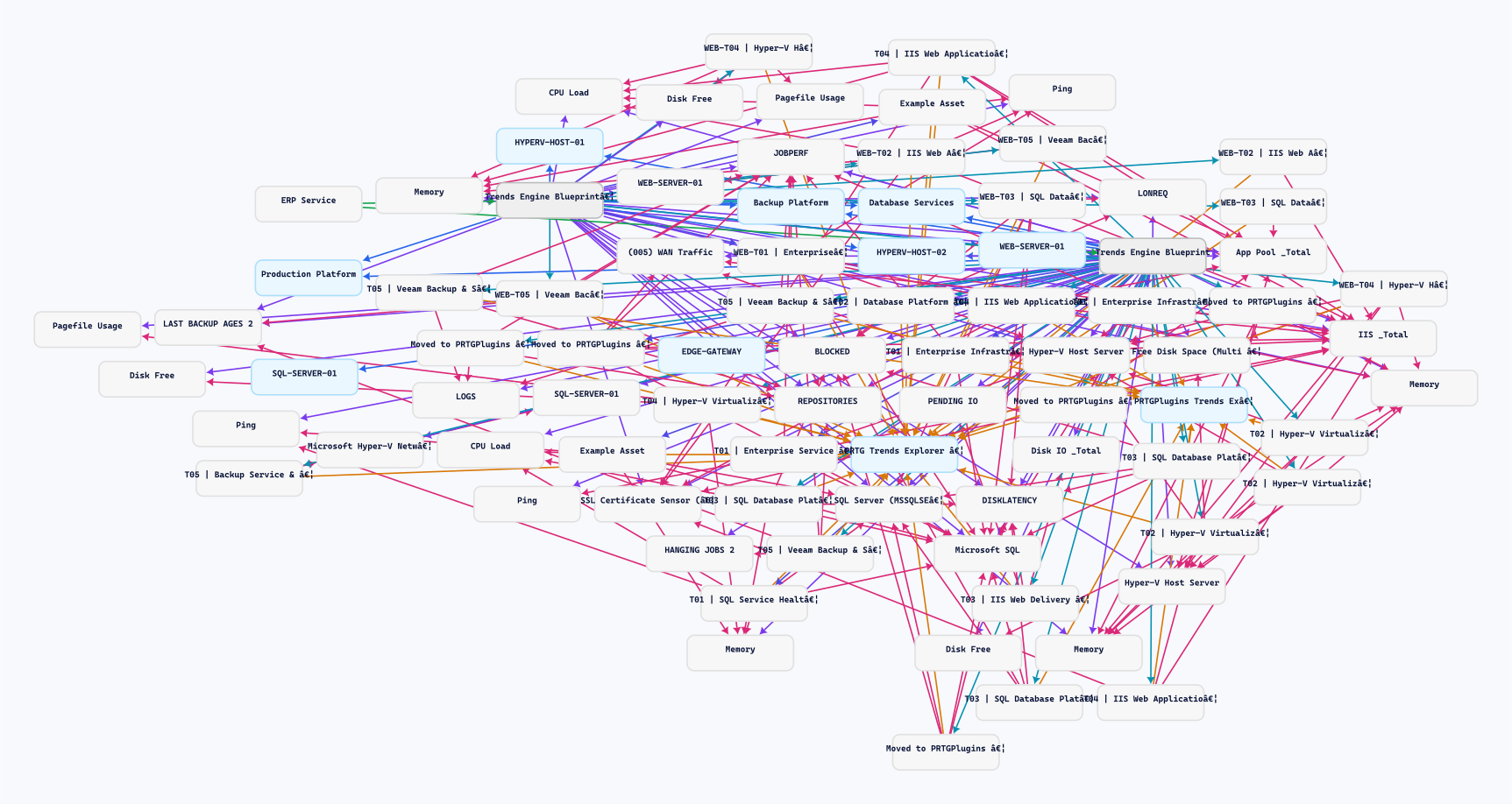
Understand how much is connected — before narrowing the question.
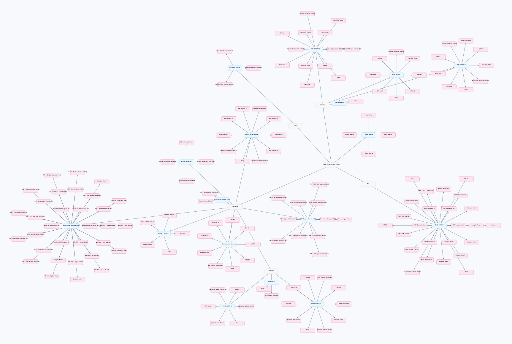
The complete map shows service blueprints, devices, Trends sensors and source sensors together. Hide unconnected assets to concentrate on the relationship network. This starting landscape gives you the context for choosing your next focus.
Pick a meaningful view from the bigger picture.
Focus on a SQL diagnostic and keep its surrounding service relationships in view. The selected asset anchors the investigation; the colored connections reveal how source measurements, other Trends views and the service blueprint fit together.
Which infrastructure supports this service?
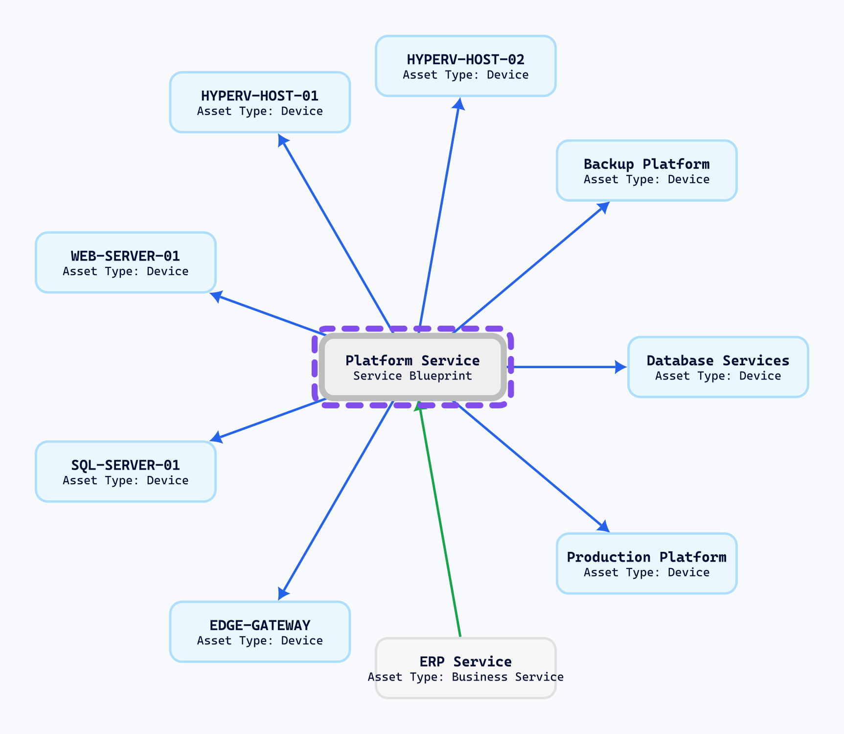
Search for the service blueprint and use Set Focus. Temporarily hide the PRTG Sensor Instance asset type to see the service's infrastructure dependencies clearly. The selected blueprint is outlined; eight infrastructure assets and its business-service relationship remain visible.
What the blue arrows tell you
They connect the blueprint to the devices and platforms it depends on. The web server, SQL platform, hosts, backups and gateway form a manageable service boundary for investigation.
What to do with that context
Use it to scope a maintenance discussion or decide which infrastructure to inspect. The declared dependencies help you identify the relevant platforms and choose the measurements to inspect.
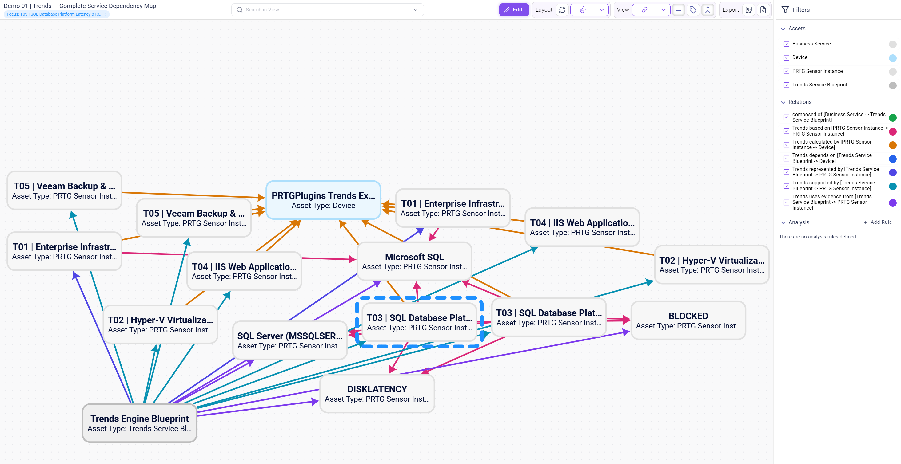
What actually underpins this SQL Trends result?
Show sensor assets again, clear the service focus and search for the current SQL Latency & IO Trends sensor. Use Set Focus on that sensor. The large network reduces to seven relevant assets: the selected Trends sensor, its service blueprint, four source sensors and the Trends Engine device.
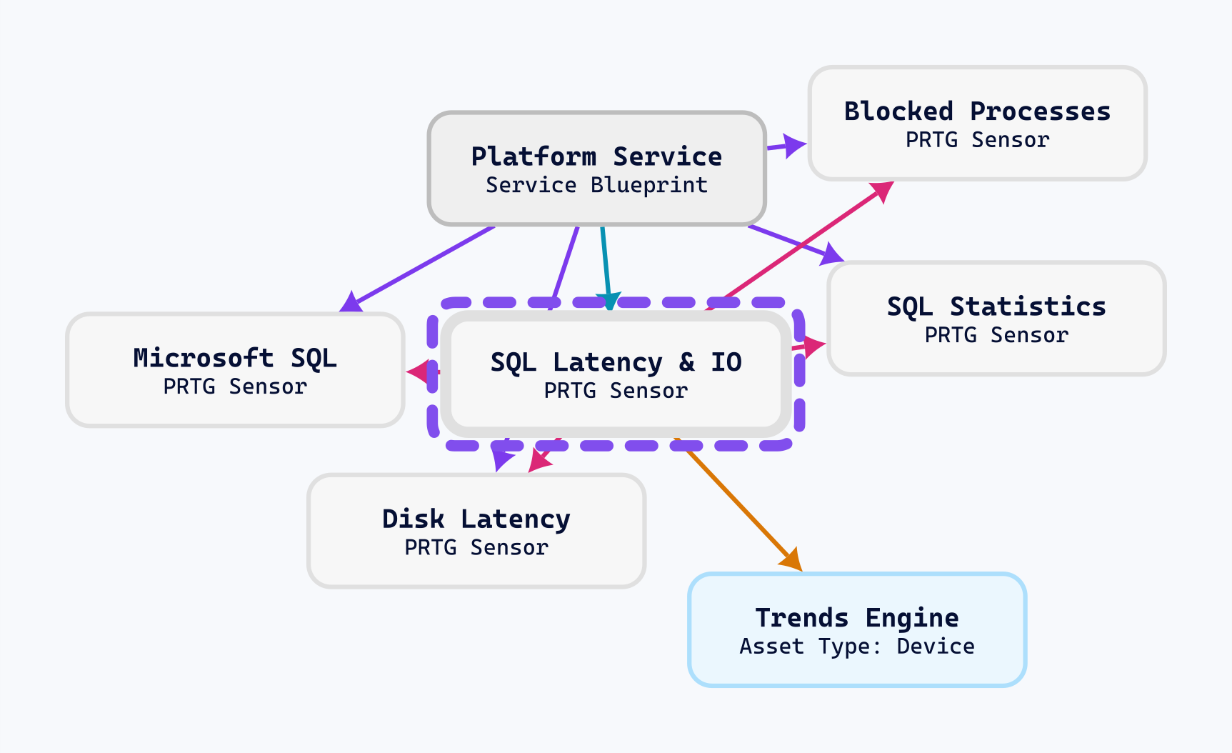
Four visible sources
Disk Latency, Blocked Processes, Microsoft SQL and SQL Statistics are the source sensors linked to this deployed diagnostic.
Check the relevant measurements
Use the selected asset's details and monitoring context to inspect source status and values. The relationships show where to look; the measurements support the diagnosis.
Keep the service connection
The blueprint remains in view, so a technical SQL investigation stays connected to the service that the diagnostic supports.
Complex relationships. A simple way to explore them.
You can move from “everything is connected” to “these are the dependencies and measurements relevant to my question”. Focus lets you explore a relevant part of the model while keeping the wider relationship network available for your next question.
From inventory to service context.
Qbilon's PRTG connector brings monitoring assets into the graph. Trends Explorer adds a service model derived from your deployed Trends configuration.
Where the monitoring assets live
Groups contain devices. Devices contain sensors. This is the natural inventory view of the PRTG environment and an essential starting point.
This comparison uses the same demo environment. Installed Trends sensors also appear as ordinary PRTG sensors in its hierarchy.
How the service is supported
A service blueprint links to its infrastructure. Its Trends sensors link to the source measurements that underpin them. The graph explains the role of each asset in the service.
Qbilon already supports relationship modelling. The added value here is the specific, repeatable Trends service and evidence model.
One service.
Its supporting world.
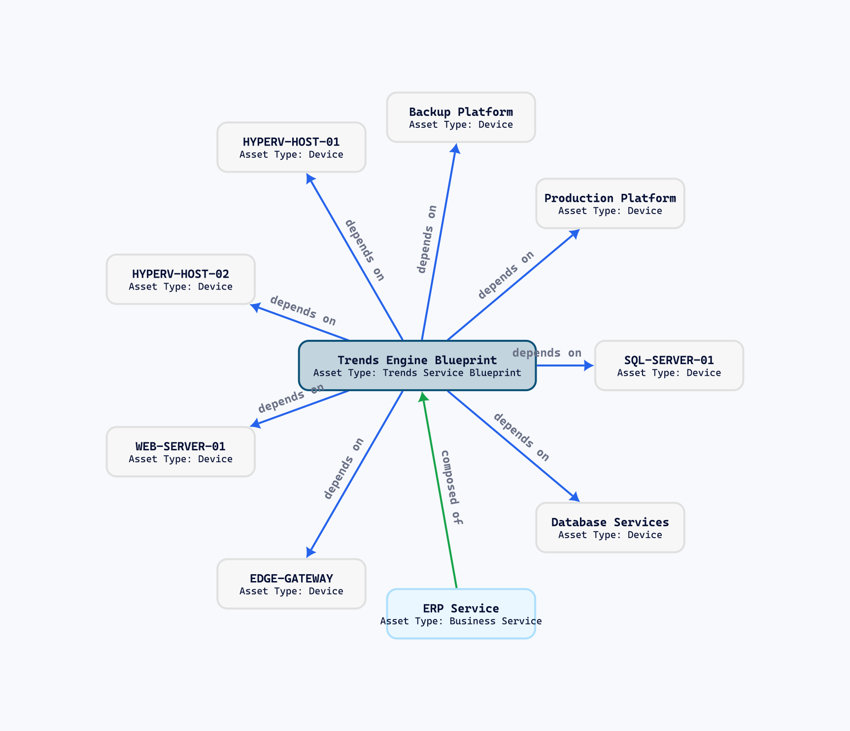
Put the blueprint at the center. The blue arrows show the infrastructure on which it depends. The green arrow connects the business service to that blueprint.
A database platform, web server, virtualization hosts, backup platform and gateway become part of one readable service story.
Ask: Which platforms should we consider when planning a change to this service?
Arrow direction describes the named relationship, giving each connection a clear meaning.
Keep the overview.
Keep the supporting detail.
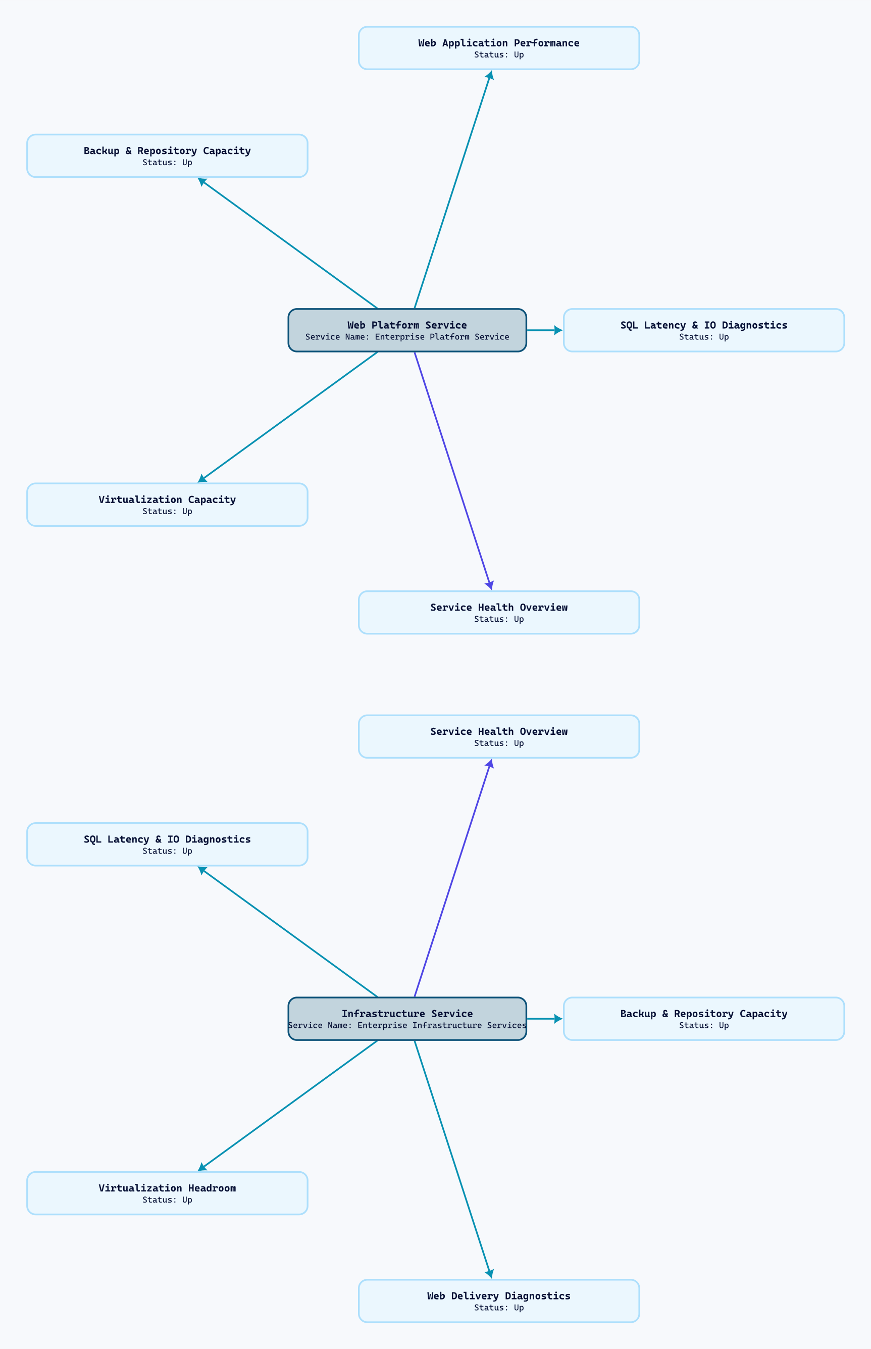
Two service blueprints each connect to five Trends sensors: one service overview and four supporting diagnostics. The operator can see both the service summary and the measurements that help explain it.
Web Platform Service
Service health, web application performance, SQL diagnostics, virtualization capacity and backup capacity — organized around a single service blueprint.
Infrastructure Service
Service health, virtualization headroom, SQL latency and IO, web delivery and backup repositories — shown as a second, distinct service context.
Every color carries a meaning.
The demo uses distinct colors for distinct relationship types. Turn on relation labels in Qbilon to read the meaning directly on the graph.
Follow a SQL diagnostic all the way back.
A SQL Trends sensor can point to the measurements selected for its calculation, while the service blueprint exposes the wider platform dependencies. That makes the graph useful for reviewing evidence and deciding what to inspect next.
The connections reflect the deployed configuration and make its selected dependencies and evidence visible.
Monitoring data → forecasts → service relationships.
Collects the source measurements and monitoring history.
Defines the selected sources, Trends views and service context.
Runs the deployed calculations and exposes Trends sensors in PRTG.
Connects the deployed service model to the corresponding monitoring assets.
Present the inventory, service overview, dependencies and evidence in Qbilon.
What should you expect?
How can I investigate a service?
Search for a service blueprint, use Set Focus and choose the asset and relationship types relevant to your question. Then select a Trends diagnostic to follow its source measurements and keep the service context visible.
Does Qbilon already support relationships?
Yes. Qbilon is a relationship-modelling and visualization platform. Trends Explorer supplies a specific service blueprint and evidence model from its deployed configuration, alongside the assets imported from PRTG.
Will synchronization preserve custom views?
The integration updates its compatible deployment view while preserving its layout, filters and unrelated styling. These separately created demo views are presentation examples. Newly added assets can affect an automatic layout; views restricted to explicit sensor IDs need updating if those sensor objects are replaced.
Are these real examples?
Yes. The diagrams are exported from verified Qbilon demo graphs. Environment names have been anonymized and some long labels shortened. The maps show example configurations and their captured monitoring state.
What do I need to use this?
A working PRTG environment, a deployed Trends configuration and a Qbilon environment with the appropriate connection and access. The Qbilon integration is available with Trends Explorer Starter and Enterprise; PRTG and Qbilon licensing remain separate.
Can I explore the complete graph?
Open the full anonymized demo map. It brings inventory assets and connected service relationships together in one view. Focused views are usually clearer for explaining an individual service.
Give your forecasts a service context.
Start with the measurements you trust. Build the Trends you need. Then show how the results connect to the services your organization depends on.
Explore Trends ExplorerLearn about QbilonPRTG and Qbilon are products of their respective owners. Diagrams shown here are anonymized demonstration examples.